Peculiarities in text wrapping across platforms
what’s so wrong with a rag, apple?
—James
I’ve spent a fair bit of time tinkering with the CSS on less.coffee. A significant portion of that time was spent fidgeting with text wrapping. In particular, I’ve been testing out the (relatively) new “pretty” option for text wrapping. Overall, it seems to work, but I’ve noticed some unexpected nuance in rendering across different platforms.
For example, see the screenshot below. On macOS Chrome dev tools “responsive mode” vs iOS Safari, these two pages wrap text at different points in the paragraph:
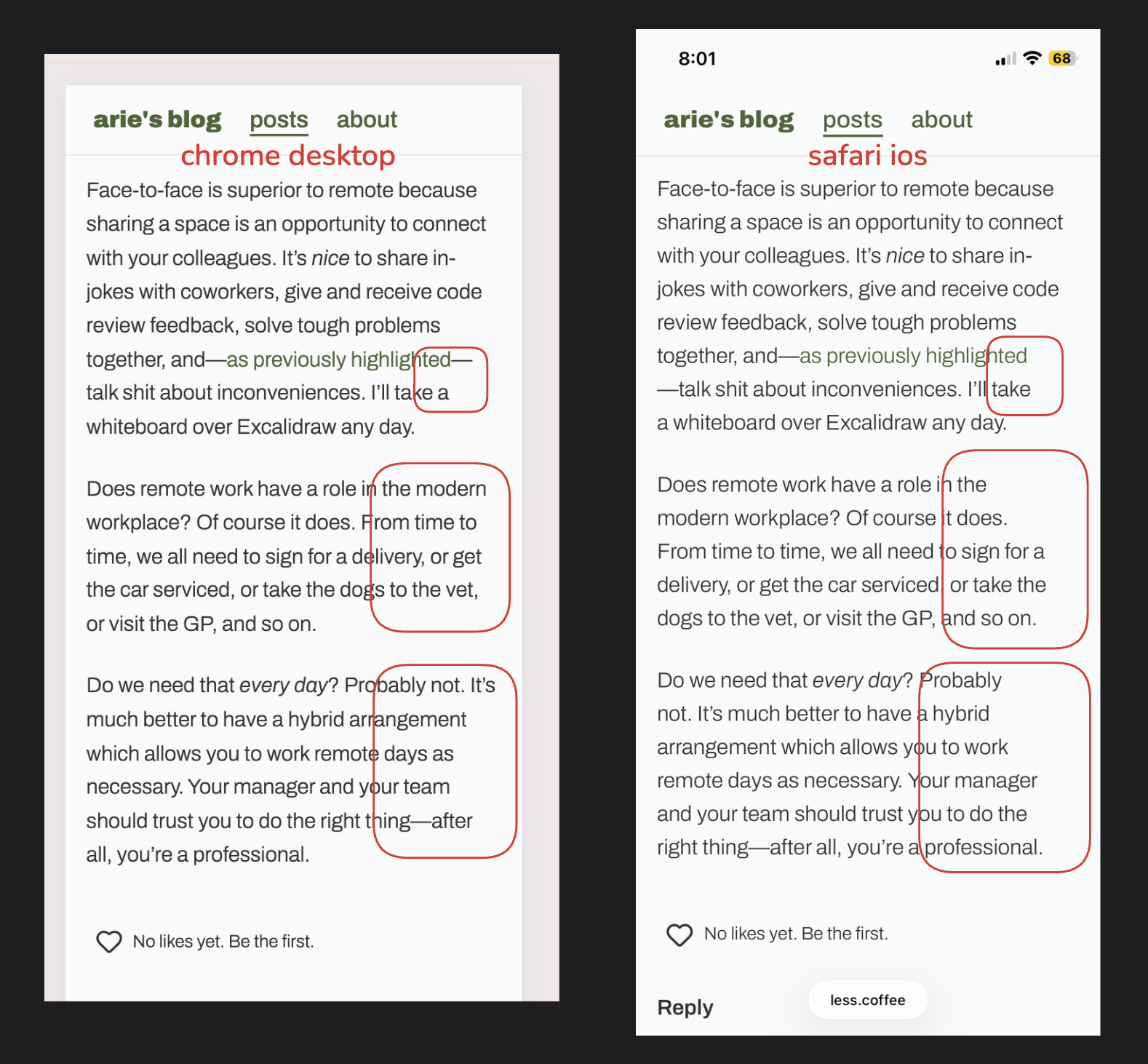
There are differences in line breaks.
Believe it or not: both screenshots have text-wrap: pretty applied.
Could it be subpixel antialiasing? macOS disables subpixel AA, but I thought that iOS must be allowing it, since the font rendering looks a lot thinner and sharper. That might affect the width of each character? I’m not using the font-smoothing reset either. But this doesn’t really make sense—if Apple disables subpixel AA on macOS because of Retina Display, then surely they would disable it on iOS from the start, since the iPhone pixel density has historically been higher than a desktop monitor.
I can’t find a source, but I am pretty sure iOS never had subpixel AA because you can’t guarantee the orientation of the device, so you effectively need to implement subpixel logic for two distinct subpixel configurations.
I concluded that Safari must use the OS’s text wrapping algorithms, because this looks the same in iOS Chrome. It also seems like iOS has a slightly different text wrapping algorithm. Maybe it’s more aggressively trying to balance the rag? An interesting property I noticed was that the length of the shortest line (or LOSL) is greater on iOS compared to macOS:
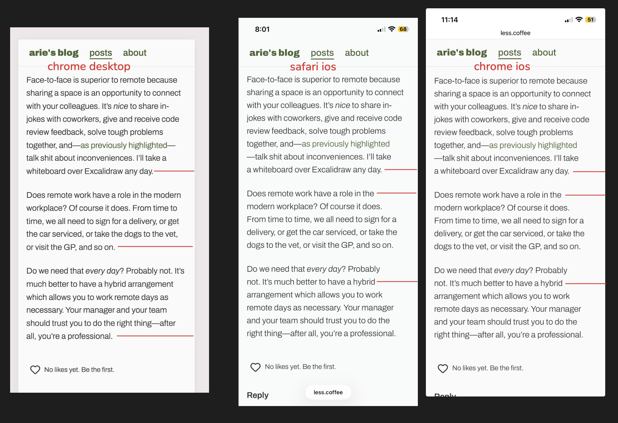
Length of shortest line is different too.
Finally, I decided to test a website out in the wild, with default user agent text-wrap, and this is the difference:
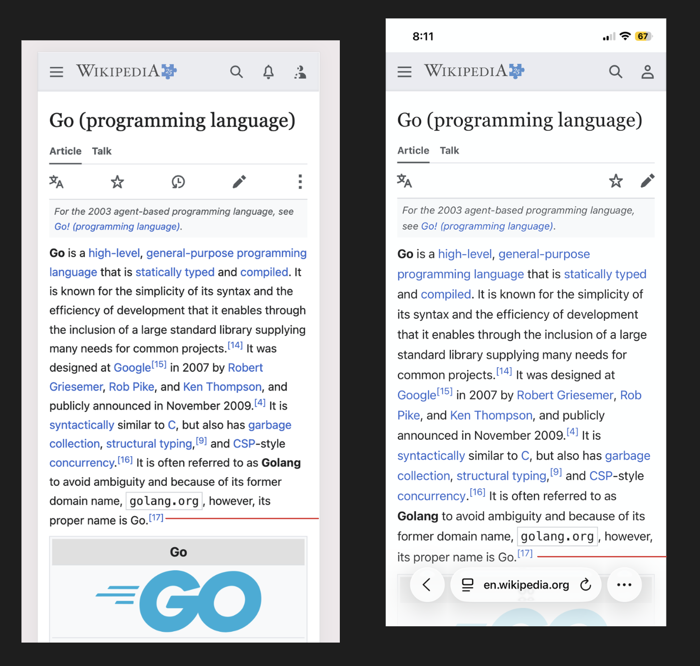
Side by side screenshots of the Wikipedia page for the Go programming language. macOS on left, iOS on right.
I have a hard time deciding if left or right is better in this screenshot. Left looks pretty dense, but right’s rag is a bit more jagged. The LOSL is quite similar between both paragraphs.
I could be scaling the image wrong, but it really seems like iOS renders the font slightly bigger. That would explain why inline iconography sometimes looks out of position on iOS—placing a block element inline with a text span ends up looking out of alignment when the text height adjusts the container height.
I went back and checked Safari on desktop and… wait, it looks just like iOS?
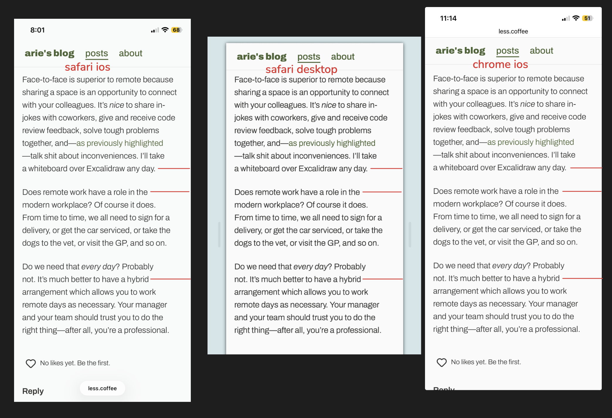
Safari desktop, Safari iOS, and Chrome iOS all wrap text the same way
So this actually means Chrome on macOS is the odd one out. What do all the other browsers share in common? I was surprised, turns out they all use WebKit—yes, even Chrome on iOS. Chrome on macOS uses Blink. According to Apple’s App Store Review Guidelines, browsers on iOS must all use WebKit. Except on a case-by-case basis in Europe and Japan, apparently.
I still don’t know exactly how the text wrapping is implemented, but I have most of my answer now. Since I’ve got the Australian app store, all my iOS browser apps use WebKit. They render the slightly more balanced typography which maximises LOSL. Chrome on macOS renders using a different text wrapping algorithm. Maybe it’s less computationally expensive, because Chrome is meant to be performance-conscious? I don’t know. It’s getting late.
There’s nothing else to conclude here, other than the fact that I find it interesting. Even with the same viewport width, same CSS, same assets, the two different browser engines render text subtly differently. Something to consider when designing websites!
Audio Attribution
“Maple Leaf Rag” Kevin MacLeod (incompetech.com)
Licensed under Creative Commons: By Attribution 4.0 License
http://creativecommons.org/licenses/by/4.0/